2015 Earthquake in Nepal : Earthquake magnitude and Casualty Analysis
In this blogpost, I am going to take the earthquake data from April 2015 to May 2016 throughout the World. Then we will process the data in usable form and look at the data on Nepal. Later, we will also dive into the casualties from this devastating earthquake. We will look at how many people died, got injured from which district, using ggplot2, wordcloud and leaflet package.
Let’s get going.
First let’s load the libraries that we will be using.
library(tidyverse)
library(leaflet)
library(lubridate)
library(tidyr)
library(wordcloud)
library(visdat)
library(scales)
library(knitr)
We will be using the data from Asheshwor’s github repository https://github.com/asheshwor/np-quake The file we will be using is all_month_merged.csv. I have downloaded the csv file and saved into my data folder. Now let’s read the data.
# Analyzing Nepal earthquake data
all_month <- read.csv(file = "../../data/earthquake/all_month_merged.csv",
                      stringsAsFactors = FALSE)
str(all_month)
## 'data.frame': 81699 obs. of 15 variables:
## $ time : chr "2016-05-29T08:27:33.350Z" "2016-05-29T06:45:59.910Z" "2016-05-29T06:34:13.930Z" "2016-05-29T05:58:39.120Z" ...
## $ latitude : num 32 36.1 -20.5 10.6 36.3 ...
## $ longitude: num -115.21 70.81 -63.24 -40.99 3.51 ...
## $ depth : num 1.42 92.05 562.89 10 10 ...
## $ mag : num 3.61 4.5 4.3 5 4.2 4.4 2.6 3.3 4.2 2.7 ...
## $ magType : chr "mlr" "mb" "mb" "mb" ...
## $ nst : int 22 NA NA NA NA NA NA NA NA NA ...
## $ gap : num 262 81 43 43 96 77 59 31 91 NA ...
## $ dmin : num 0.302 1.622 5.198 17.105 3.842 ...
## $ rms : num 0.41 0.78 0.9 0.73 1.16 1.02 0.44 0.33 0.76 0.54 ...
## $ net : chr "ci" "us" "us" "us" ...
## $ id : chr "ci37577944" "us20005z01" "us20005yzy" "us20005yzt" ...
## $ updated : chr "2016-05-29T08:30:05.446Z" "2016-05-29T07:21:17.154Z" "2016-05-29T06:51:56.741Z" "2016-05-29T06:23:30.881Z" ...
## $ place : chr "23km S of Alberto Oviedo Mota, B.C., MX" "4km NE of `Alaqahdari-ye Kiran wa Munjan, Afghanistan" "9km SSE of Boyuibe, Bolivia" "Northern Mid-Atlantic Ridge" ...
## $ type : chr "earthquake" "earthquake" "earthquake" "earthquake" ...Let’s visualize our unprocessed data using visdat package:
visdat::vis_dat(all_month, palette = "qual", sort_type = FALSE, warn_large_data = FALSE)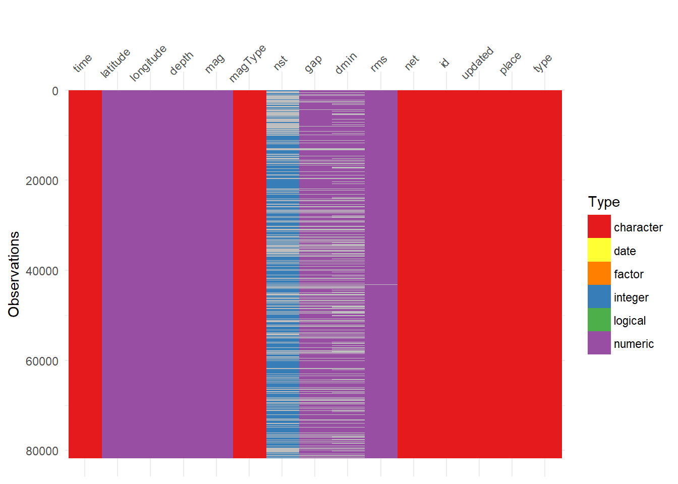
It is a really nice way to see our variables and observations in a graphical form. We can see that variables nst, gap, and dmin have a lot of missing data.
Let’s look at head of the dataset:
head(all_month)## time latitude longitude depth mag magType nst gap
## 1 2016-05-29T08:27:33.350Z 32.0230 -115.2117 1.42 3.61 mlr 22 262
## 2 2016-05-29T06:45:59.910Z 36.0551 70.8097 92.05 4.50 mb NA 81
## 3 2016-05-29T06:34:13.930Z -20.4974 -63.2433 562.89 4.30 mb NA 43
## 4 2016-05-29T05:58:39.120Z 10.6169 -40.9928 10.00 5.00 mb NA 43
## 5 2016-05-29T05:23:10.660Z 36.2786 3.5091 10.00 4.20 mb NA 96
## 6 2016-05-29T05:10:48.040Z 20.4756 120.3505 10.00 4.40 mb NA 77
## dmin rms net id updated
## 1 0.3019 0.41 ci ci37577944 2016-05-29T08:30:05.446Z
## 2 1.6220 0.78 us us20005z01 2016-05-29T07:21:17.154Z
## 3 5.1980 0.90 us us20005yzy 2016-05-29T06:51:56.741Z
## 4 17.1050 0.73 us us20005yzt 2016-05-29T06:23:30.881Z
## 5 3.8420 1.16 us us20005yzj 2016-05-29T06:12:24.532Z
## 6 2.4270 1.02 us us20005yzh 2016-05-29T05:42:19.667Z
## place type
## 1 23km S of Alberto Oviedo Mota, B.C., MX earthquake
## 2 4km NE of `Alaqahdari-ye Kiran wa Munjan, Afghanistan earthquake
## 3 9km SSE of Boyuibe, Bolivia earthquake
## 4 Northern Mid-Atlantic Ridge earthquake
## 5 14km W of Ain Bessem, Algeria earthquake
## 6 159km W of Sabtang, Philippines earthquakeWe can see that our time column in not is data or POSIXct format. Let’s go a head and fix that date format and add couple variables year and month.
all_month <- all_month %>%
  # Add a new column named date
  mutate(date = gsub(time, pattern = "T", replacement = " ") %>%
           gsub(., pattern = ".[0-9]+Z", replacement = "") %>%
           ymd_hms(.))

# Examine head with new variables
all_month %>% select(time, latitude,longitude, place, date) %>% head()
## time latitude longitude
## 1 2016-05-29T08:27:33.350Z 32.0230 -115.2117
## 2 2016-05-29T06:45:59.910Z 36.0551 70.8097
## 3 2016-05-29T06:34:13.930Z -20.4974 -63.2433
## 4 2016-05-29T05:58:39.120Z 10.6169 -40.9928
## 5 2016-05-29T05:23:10.660Z 36.2786 3.5091
## 6 2016-05-29T05:10:48.040Z 20.4756 120.3505
## place
## 1 23km S of Alberto Oviedo Mota, B.C., MX
## 2 4km NE of `Alaqahdari-ye Kiran wa Munjan, Afghanistan
## 3 9km SSE of Boyuibe, Bolivia
## 4 Northern Mid-Atlantic Ridge
## 5 14km W of Ain Bessem, Algeria
## 6 159km W of Sabtang, Philippines
## date
## 1 2016-05-29 08:27:33
## 2 2016-05-29 06:45:59
## 3 2016-05-29 06:34:13
## 4 2016-05-29 05:58:39
## 5 2016-05-29 05:23:10
## 6 2016-05-29 05:10:48Next thing we are going to fix is the place column. In this column, the text before comma is the information about the place and text after comma is the information about country / state. Let’s us now separate this string into two columns.
all_month$country <-
  as.character(lapply(1:nrow(all_month),
                      FUN = function(x)
                        tail(strsplit(all_month$place[x],
                                      split = ",")[[1]],n=1L)))

# Remove all the white spaces from column country
all_month$country <- gsub("[[:space:]]", "", x = all_month$country)
I also remove the starting and trailing spaces on my country column.
Let’s examine our data frame again with few columns. The reason I am taking only few columns to display is to save some space.
all_month %>% select(date, latitude, longitude, country) %>% head()## date latitude longitude country
## 1 2016-05-29 08:27:33 32.0230 -115.2117 MX
## 2 2016-05-29 06:45:59 36.0551 70.8097 Afghanistan
## 3 2016-05-29 06:34:13 -20.4974 -63.2433 Bolivia
## 4 2016-05-29 05:58:39 10.6169 -40.9928 NorthernMid-AtlanticRidge
## 5 2016-05-29 05:23:10 36.2786 3.5091 Algeria
## 6 2016-05-29 05:10:48 20.4756 120.3505 Philippines# Total number of unique countries
length(unique(all_month$country))## [1] 283There are data of 286 countries.
We will now add day, and month columns to all_month dataframe.
# Add month, day, and julian
all_month <- all_month %>%
  mutate(day = day(date),
         month = month(date),
         julian = julian(date, origin = ymd("2015-01-01")) %>%
           floor() %>% as.numeric())
Create a dataframe for country Nepal by using dplyr function filter
# Now filter for the country Nepal
nepal_data <- all_month %>% dplyr::filter(country == "Nepal")
head(nepal_data)
## time latitude longitude depth mag magType nst gap
## 1 2016-05-28T09:39:10.980Z 28.0134 85.4281 10.00 4.7 mb NA 74
## 2 2016-05-23T19:09:53.080Z 27.7400 85.0803 10.00 4.3 mb NA 87
## 3 2016-05-14T22:45:55.410Z 27.8199 85.3181 22.48 4.3 mb NA 88
## 4 2016-05-13T23:20:59.460Z 27.9580 85.5191 10.00 4.0 mb NA 104
## 5 2016-05-11T01:19:42.350Z 27.9478 84.9271 10.54 4.5 mb NA 104
## 6 2016-04-12T14:41:52.170Z 27.6062 86.0621 10.00 4.3 mb NA 146
## dmin rms net id updated
## 1 0.315 1.40 us us20005ysr 2016-05-28T10:34:15.107Z
## 2 0.210 0.91 us us10005jdi 2016-05-25T22:03:19.651Z
## 3 0.107 0.43 us us10005hgq 2016-05-14T23:42:39.975Z
## 4 0.303 0.82 us us10005ivg 2016-05-27T03:54:54.132Z
## 5 0.416 1.01 us us10005ihi 2016-05-26T00:48:30.120Z
## 6 0.670 0.93 us us20005heg 2016-05-11T14:54:32.777Z
## place type date country day
## 1 34km NNW of Nagarkot, Nepal earthquake 2016-05-28 09:39:10 Nepal 28
## 2 20km WNW of Kirtipur, Nepal earthquake 2016-05-23 19:09:53 Nepal 23
## 3 13km N of Kathmandu, Nepal earthquake 2016-05-14 22:45:55 Nepal 14
## 4 26km N of Nagarkot, Nepal earthquake 2016-05-13 23:20:59 Nepal 13
## 5 45km NW of Kirtipur, Nepal earthquake 2016-05-11 01:19:42 Nepal 11
## 6 31km N of Ramechhap, Nepal earthquake 2016-04-12 14:41:52 Nepal 12
## month julian
## 1 5 513
## 2 5 508
## 3 5 499
## 4 5 498
## 5 5 496
## 6 4 467Let’s quickly plot the latitude,longitude and magnitude using ggplot:
ggplot(nepal_data) + geom_point(aes(longitude, latitude, color = mag)) +
  scale_color_continuous(low = "red", high = "blue")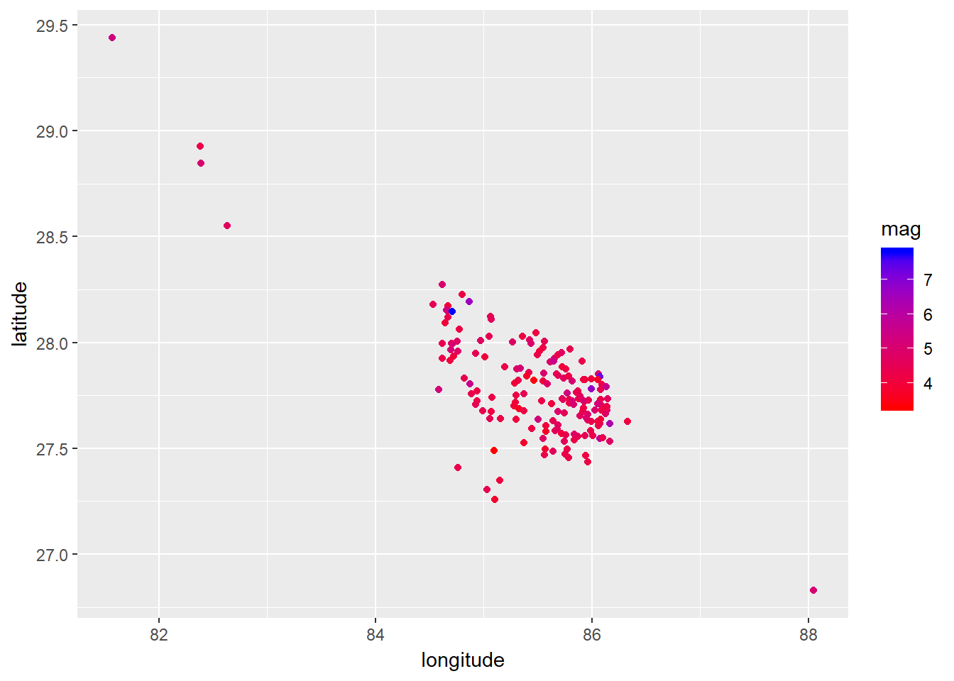
The devastating earthquake occurred on 2015-04-25 in Nepal. So, let’s examine the earthquake for that particular day.
# Total number of earthquakes on April 25th
nepal_data %>% dplyr::filter(date > as.POSIXct("2015-04-24 23:59:59", tz = "UTC"),
                             date < as.POSIXct("2015-04-26 00:00:00", tz = "UTC")) %>%
  select(date, mag, place) %>%
summary() %>% knitr::kable()| date | mag | place | |
|---|---|---|---|
| Min. :2015-04-25 06:11:26 | Min. :4.200 | Length:33 | |
| 1st Qu.:2015-04-25 07:47:01 | 1st Qu.:4.500 | Class :character | |
| Median :2015-04-25 09:30:29 | Median :4.800 | Mode :character | |
| Mean :2015-04-25 11:50:21 | Mean :4.897 | NA | |
| 3rd Qu.:2015-04-25 13:36:14 | 3rd Qu.:5.000 | NA | |
| Max. :2015-04-25 23:41:52 | Max. :7.800 | NA |
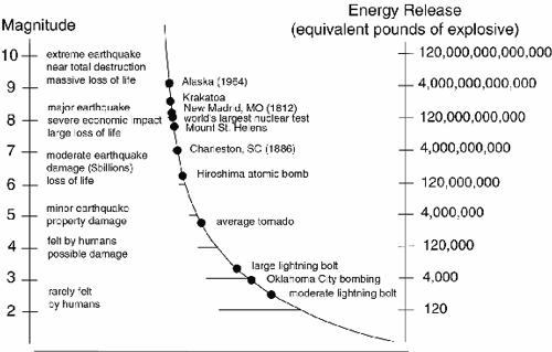
Earthquake actually occurred 33 times and the magnitude of earthquake varied from 4.2 to 7.8 richter. The energy released from earthquake has a exponential relationship with the magnitude. Let’s look at the image below from the Geological Society of America, of earthquake magnitudes and the equivalent energy release.
Earthquake
Boxplot from April 25th to April 30th, 2015
Let’s plot the boxplot for days from April 25th to April 30th.
nepal_data %>%
  dplyr::filter(date > as.POSIXct("2015-04-1 00:00:00", tz = "UTC"),
                date < as.POSIXct("2015-04-30 23:59:00", tz = "UTC")) %>%
  ggplot() +
geom_boxplot(aes(date, mag, group = day)) 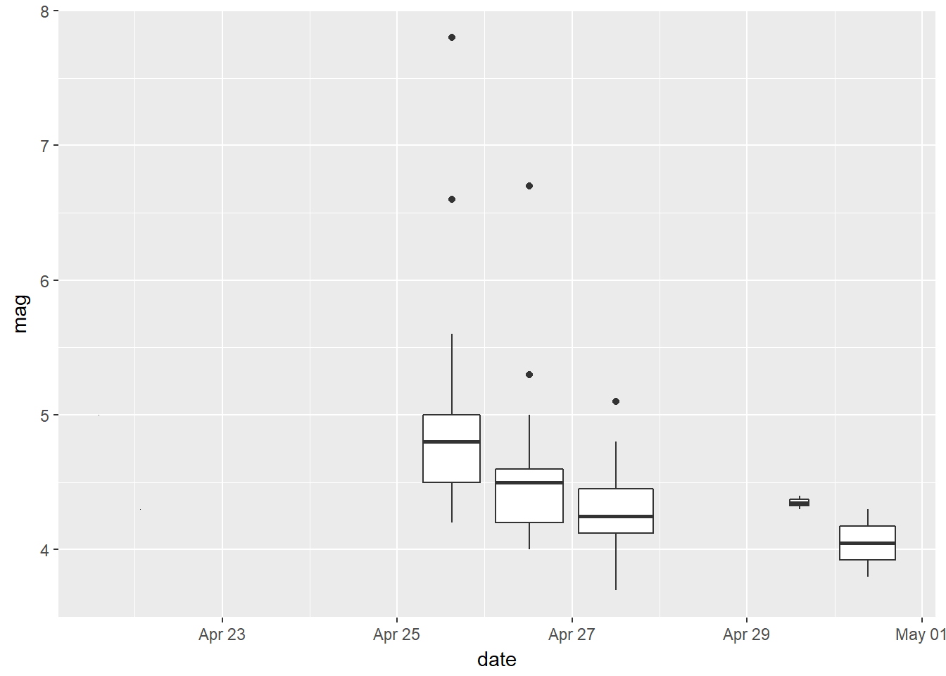
Visualizing the locations on the map using leaflet package
We will now look into the leaflet package and plot the exact locations using latitude, longitude and magnitude of the earthquake.
nepal_data2 <- nepal_data %>%
  dplyr::filter(date > as.POSIXct("2015-04-24 23:59:59", tz = "UTC"),
                date < as.POSIXct("2015-04-26 00:00:00", tz = "UTC"))

# Following two lines of code were borrowed from Asheshwor's np-quake repository
nepal_data2$size <- cut(nepal_data2$mag,
                        c(2, 3.9, 4.9, 5.9, 6.9, 7.9),
                        labels = c("3.3 to 3.9", ">3.9 to 4.9", ">4.9 to 5.9", ">5.9 to 6.9", ">6.9 to 7.9" ))

pallet <- colorFactor(c("gray32", "dodgerblue4",  "slateblue4", "purple", "firebrick1"),
                      domain = c("3.3 to 3.9", ">3.9 to 4.9", ">4.9 to 5.9", ">5.9 to 6.9", ">6.9 to 7.9"))

library(leaflet)
#pal <- colorQuantile(palette = "YlOrRd", domain = nepal_data2$mag)

m <- leaflet(options = leafletOptions(miniZoom =8, maxZoom = 8),
             #width = "100%",
             data = nepal_data2) %>%
  addTiles() %>% # Add default OpenStreetMap map tiles
  leaflet::addCircleMarkers(lng = ~longitude,
                            lat = ~latitude,
                            stroke = FALSE,
                            fillOpacity = 0.8,
                            fillColor = ~pallet(size),
                            label = paste("mag=", nepal_data2$mag,
                                          "\n", "location = ",
                                          nepal_data2$place)
                            ) %>%
        addLegend(
        "bottomleft", pal = pallet,
        values = sort(nepal_data2$size),
        title = "Magnitude"
        # labFormat = labelFormat()
      )
m
Monthwise box plot of earthquake magnitude
give.n <- function(x){
  return(c(y = mean(x), label = length(x)))
}

# Nepal monthwise box plot
nepal_data %>%
  dplyr::filter(date > ymd_hms("2015-01-01 00:00:00"),
                  date < ymd_hms("2016-01-01 00:00:00")) %>%
  ggplot(aes(cut(date, breaks="month"), mag)) + geom_boxplot() +
  stat_summary(fun.data = give.n, geom = "text", hjust = -0.5, color = "blue") +
  xlab("Date") + ylab("Magnitude")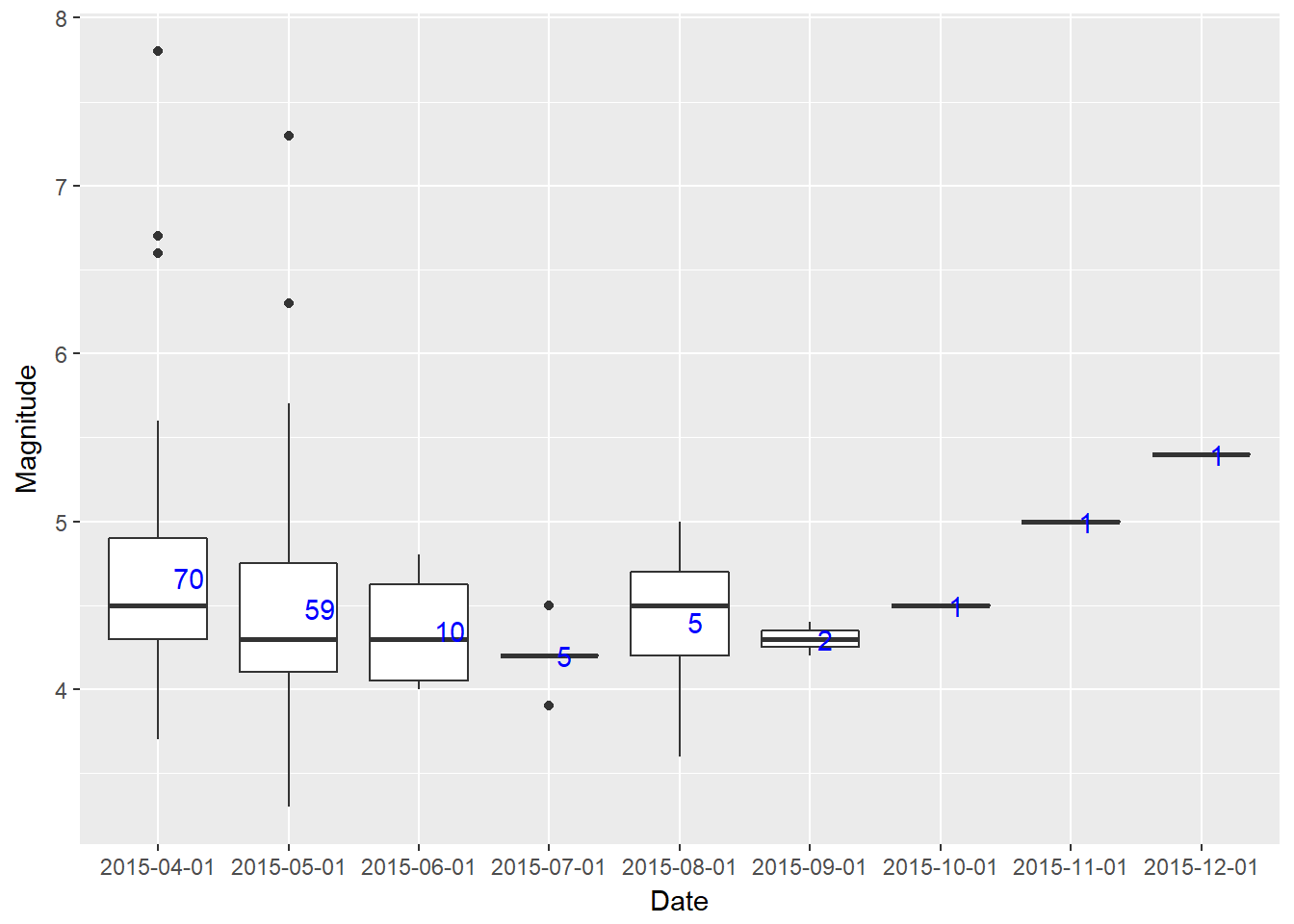
Note that I have used give.n function to print the total number of earthquake occurrences each month. Note that the dataset has the data only from April 25. So the acutal number of total occurrences for the month of April 2015 would be higher. This 7.8 richter earthquake caused the death of around 9000 people.
Casualies by Earthquake
Nepal government has made a spreadsheet available that has recorded the casualties by district. The data can be accessed on this page
The name of the spreadsheet is Key Government Figures - Nepal Earthquake - 2015.xlsx and we will be using 05-June-2015 sheet.
In order to bring this google sheet package into R, we will use the fantastic googlesheets package by Jenny Bryan. Let’s bring the data into the R environment. I have saved the googlesheet to my google drive and the name of the sheet on my drive is JD_Key Government Figures - Nepal Earthquake - 2015.xlsx
# Use library googlesheets to read Nepal earthquake data
library(googlesheets)

# Authenticate googlesheets
googlesheets::gs_auth()

fatal <- gs_title(x = "JD_Key Government Figures - Nepal Earthquake - 2015.xlsx")
fatalities <- googlesheets::gs_read(ss = fatal, ws = "05-June-2015")
We have to use the function gs_auth() first in order to aunthenticate the access to our google drive account. Then we can find the googlesheet with the function gs_title. After you have brought the googlesheet in R environment, use the function gs_read to read that sheet in a dataframe.
Let’s examine the data structure again using the visdat package.
# Use visdat to visualize the type of data in a dataframe
visdat::vis_dat(fatalities, palette = "qual", sort_type = FALSE)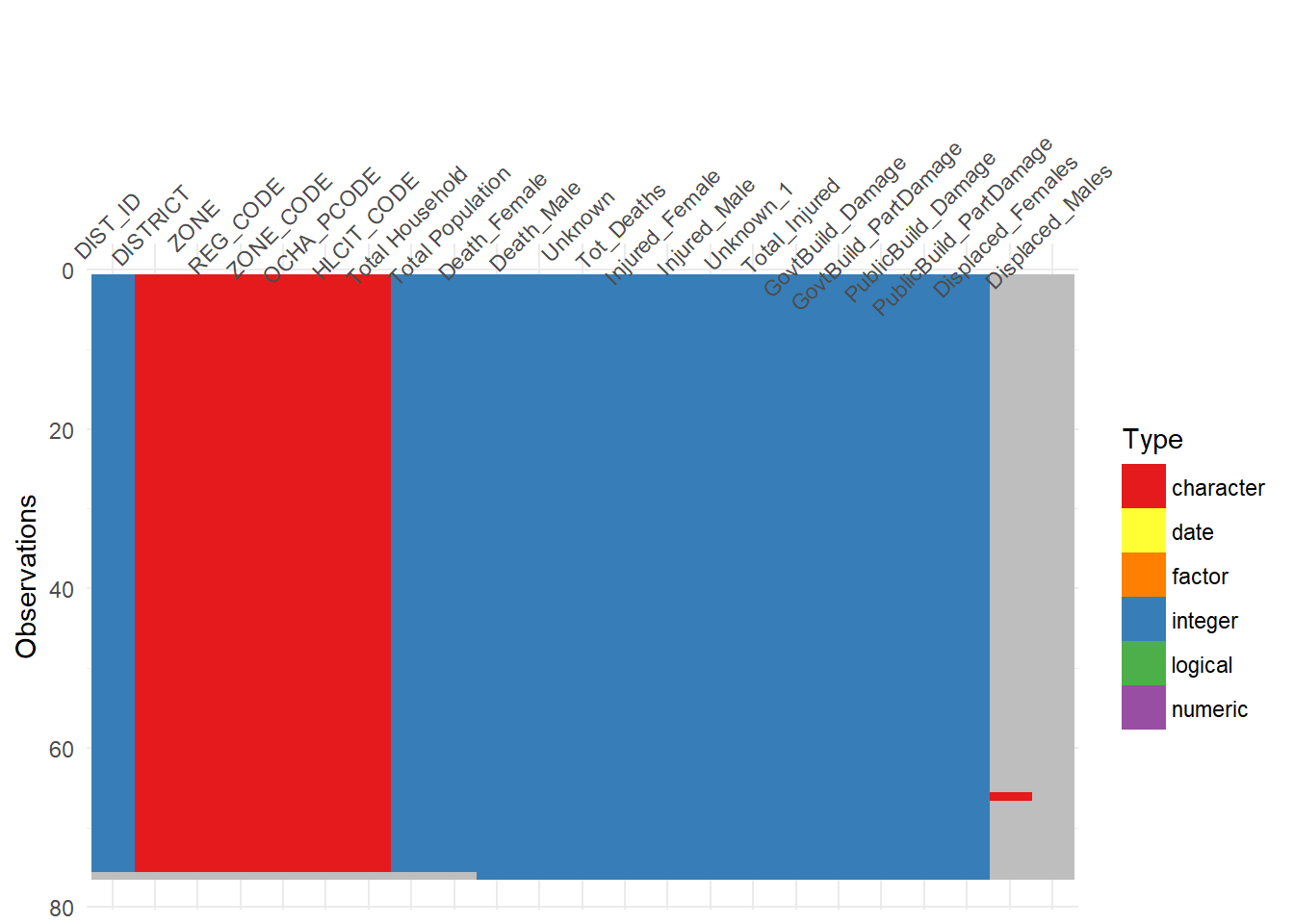
visdat::vis_miss(fatalities)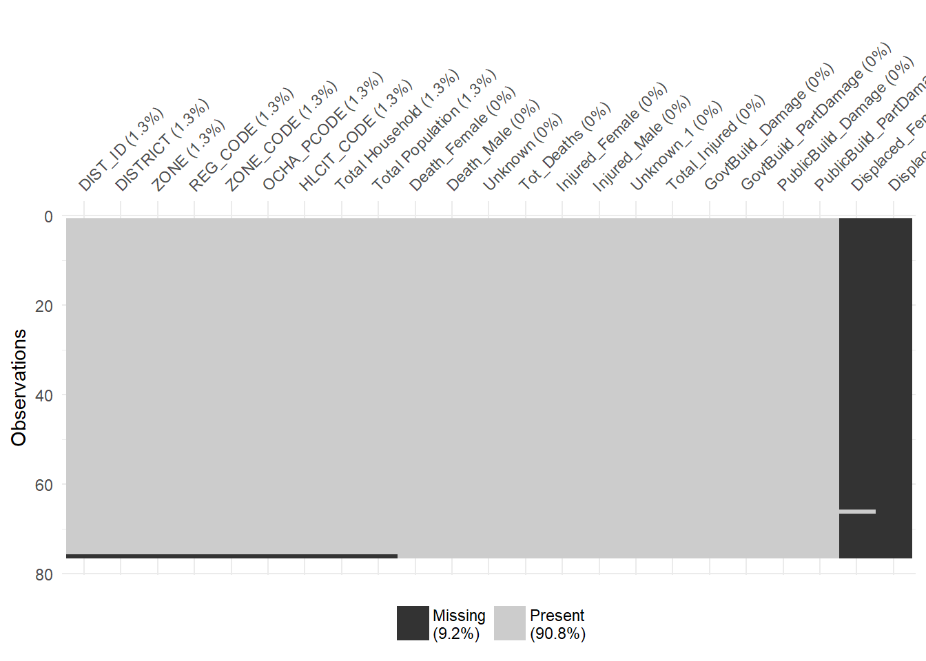
Total number of fatalities by District
In Nepal, there are 75 districts. All the data provided by the goverment is by district. We can visualize how many people died, how many got injured, how many public and government buildings were damaged by earthquake.
Total number of deaths by district
fatalities %>% dplyr::filter(!is.na(DIST_ID)) %>%
  dplyr::filter(Tot_Deaths > 1) %>%
  ggplot() + geom_col(aes(x = reorder(DISTRICT, -Tot_Deaths),
                          Tot_Deaths, fill = "red")) +
  xlab("District") + ylab("Total number of deaths") +
  theme(axis.text.x = element_text(angle = 90, hjust = 1),
        axis.text = element_text(size = 12),
        legend.position = "")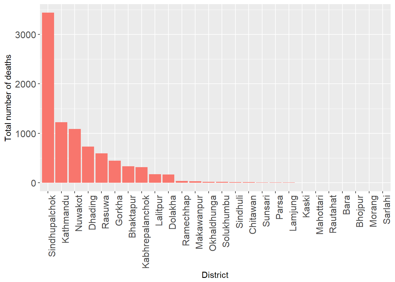
It is clear that the maximum number of people died in Sindhupalchok.
Total number of injured by District
fatalities %>% dplyr::filter(!is.na(DIST_ID)) %>%
  dplyr::filter(Total_Injured > 50) %>%
  ggplot() + geom_col(aes(x = reorder(DISTRICT, -Total_Injured), Total_Injured)) +
  geom_text(aes(x = DISTRICT, Total_Injured, label = Total_Injured),
            vjust = -0.5, color = "blue") +
  xlab("District") + ylab("Total number of Injured People") +
  theme(axis.text.x = element_text(angle = 90, hjust = 1),
        axis.text = element_text(size = 12),
        axis.title = element_text(size = 14))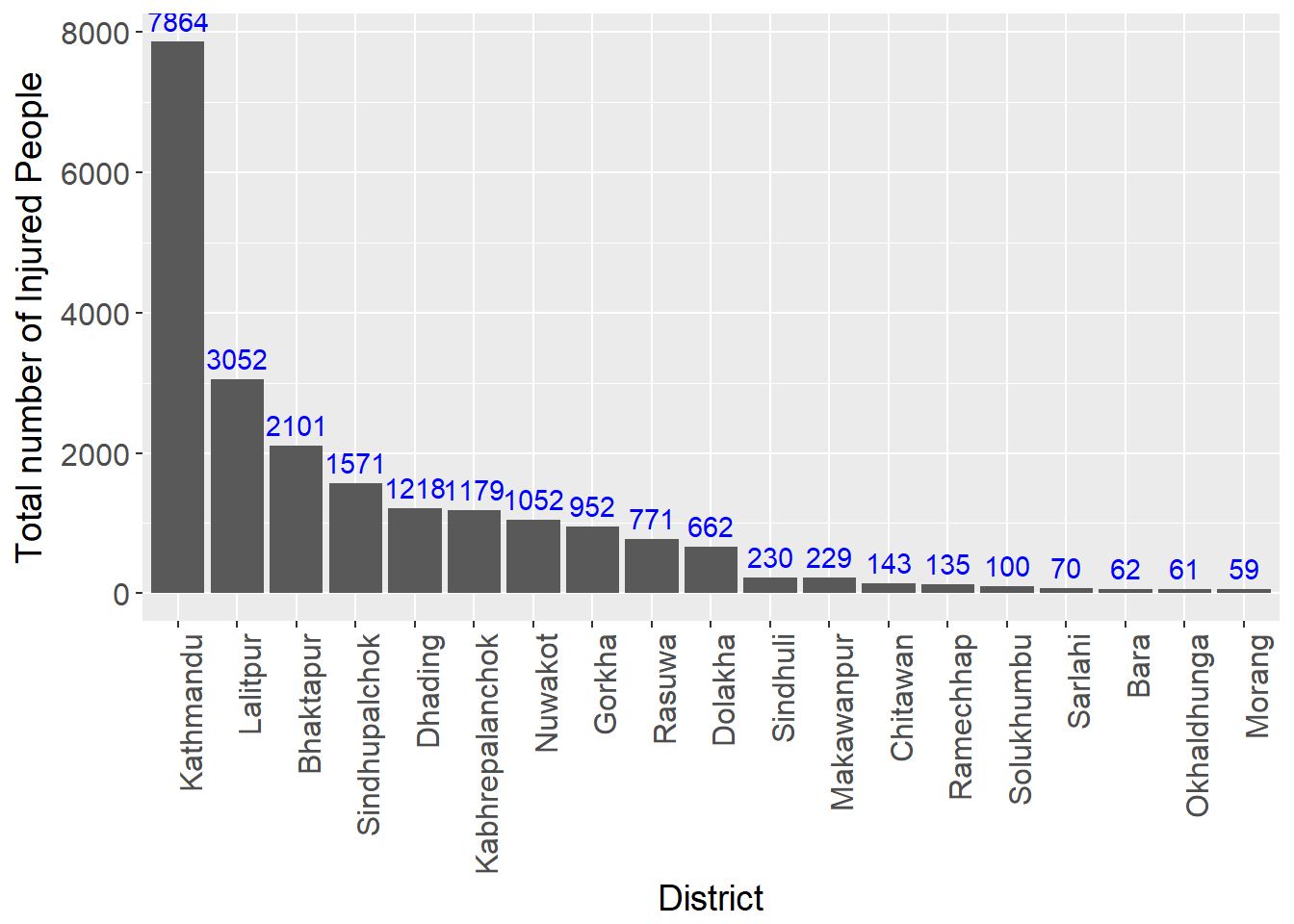
While the total number of people that died in Sindhupalchowk is highest, the highest total number of injured people ocurred in Kathmandu. Part of the reason that a lot of people got injured in Kathmandu is because the population in Kathmandu is very high compared to other districts. Kathmandu is the capital of Nepal and according to this dataset we are looking at the total population was 1744240.
Total number of government / Public buildings destroyed
fatalities %>% dplyr::filter(!is.na(DIST_ID)) %>%
  dplyr::filter(GovtBuild_Damage > 1, PublicBuild_Damage > 1) %>%
  dplyr::select(DISTRICT, GovtBuild_Damage, PublicBuild_Damage) %>%
  tidyr::gather(key = "variable", value = "value", -DISTRICT) %>%
  ggplot() + geom_bar(aes(x = reorder(DISTRICT, -value), y = value,
                          fill = variable), stat = "identity") +
  facet_wrap( ~ variable, ncol = 1, scale = "free_y") +
  xlab("DISTRICT") + ylab("Number of damaged buildings") + labs(fill = "") +
  theme(axis.text.x = element_text(angle = 90, hjust =1),
        legend.position = "")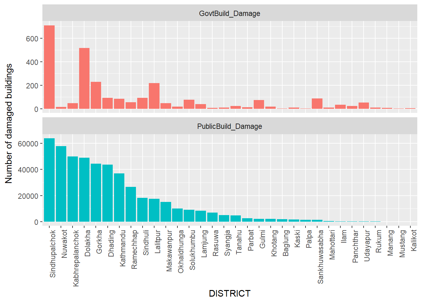
The earthquake did a lot of damage on government and public buildings throughout the country. From this graph, we can see that a lot of public buildings and private buildings were damaged in Sindhupalchowk. However, the government buildings damage is not proportional to the public building damage in other districts. While lot of public buildings got damaged in Nuwakot and Kabrepalanchok the number of government buildings got damaged are pretty low. Most of the public houses that got damaged in these districts were old houses.
Using wordcloud package to visualize the casualties
Now we are going to look into wordcloud package and plot the districts with higher frequency of death, injuries and building damages.
Let’s look at the number of people who died in the earthquake.
Before looking into the wordcloud, I am going to create a function which we can use for all the data columns. The function that I have written takes the words and frequencies and then apply color settings to our words when they are displayed. In order to be seen on the word cloud I have specified the minimum frequency to be 5.
# Word cloud
wordcloud_jd <- function(words, freq){
  wordcloud(words = words,max.words = Inf, freq = freq,
            random.order = FALSE, random.color = FALSE, scale = c(5.,.8 ),
            colors= c("indianred1","indianred2","indianred3","indianred"),
            res = 300, width = 12, height = 10)
}
We will now use the function wordcloud_jd to plot total number of people by district.
Word cloud of total number of people died by district
wordcloud_jd(words = fatalities$DISTRICT, freq = fatalities$Tot_Deaths)
Looking at the wordcloud, we can see that the maximum number of people died in Sindhupalchowk. The second is Kathmandu, and then Nuwakot and so on. That is the total number of people died in a district. Now let’s examine if the word cloud is consistent for male and female deaths.
# Word cloud for deaths by male
wordcloud_jd(words = fatalities$DISTRICT, freq = fatalities$Death_Male)
# Word cloud for deaths by female
wordcloud_jd(words = fatalities$DISTRICT, freq = fatalities$Death_Female)
From these wordclouds, we can see that maximum number of male and female that died is in Sindhupalchok. However, the second highest death for male occurred in Kathmandu while the second higest death for female occurred in Nuwakot district.
Word cloud of total number of injured by district
wordcloud_jd(words = fatalities$DISTRICT, freq = fatalities$Total_Injured)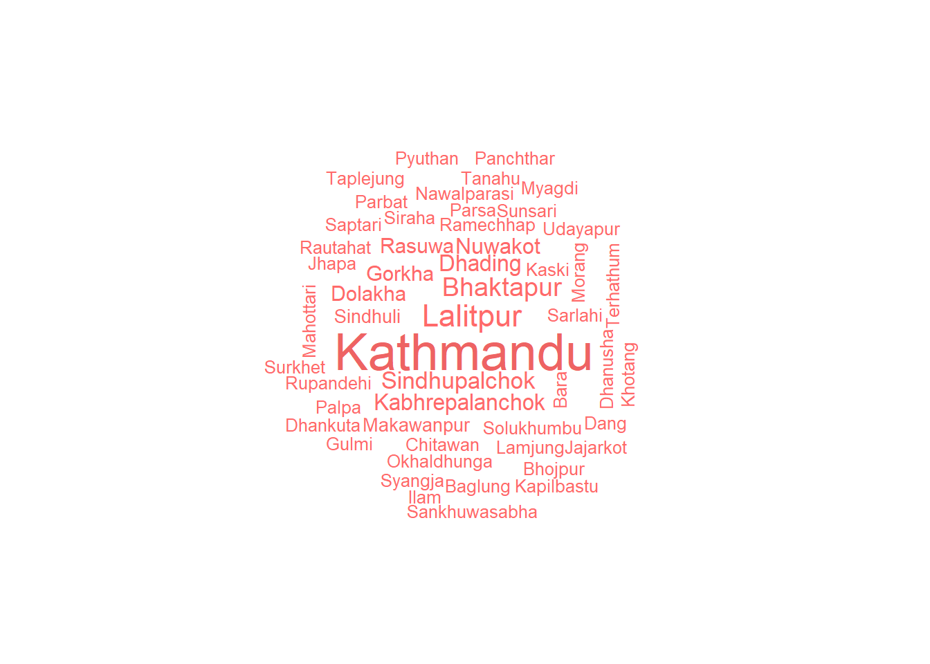
While the total number of people that died was higher in Sindhupalchowk, the injured number was very high in Kathmandu. Sindhupalchowk is the 4th in terms of total number of injured people.
We will look into more details and correlations between variable in future post.
